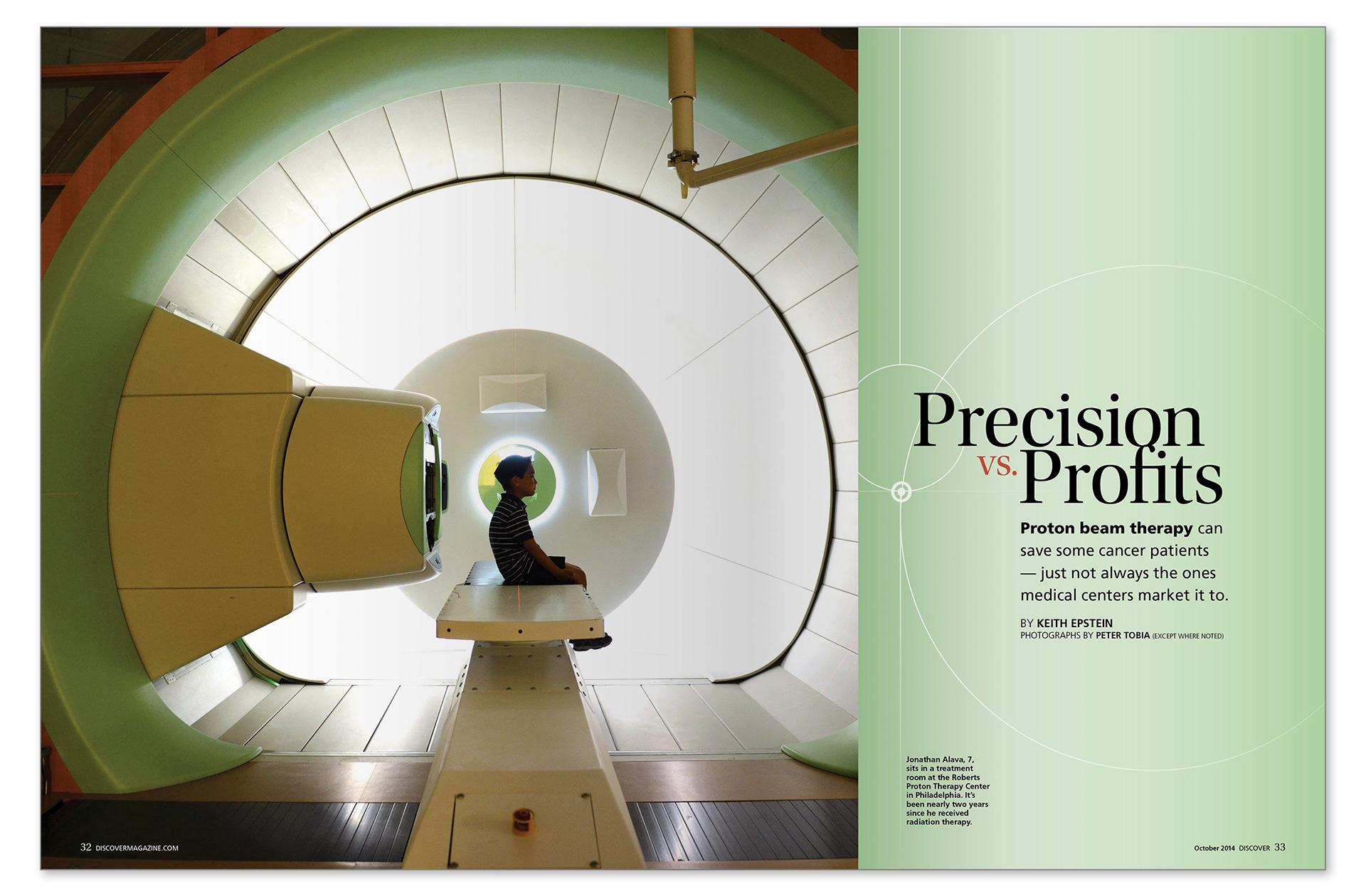
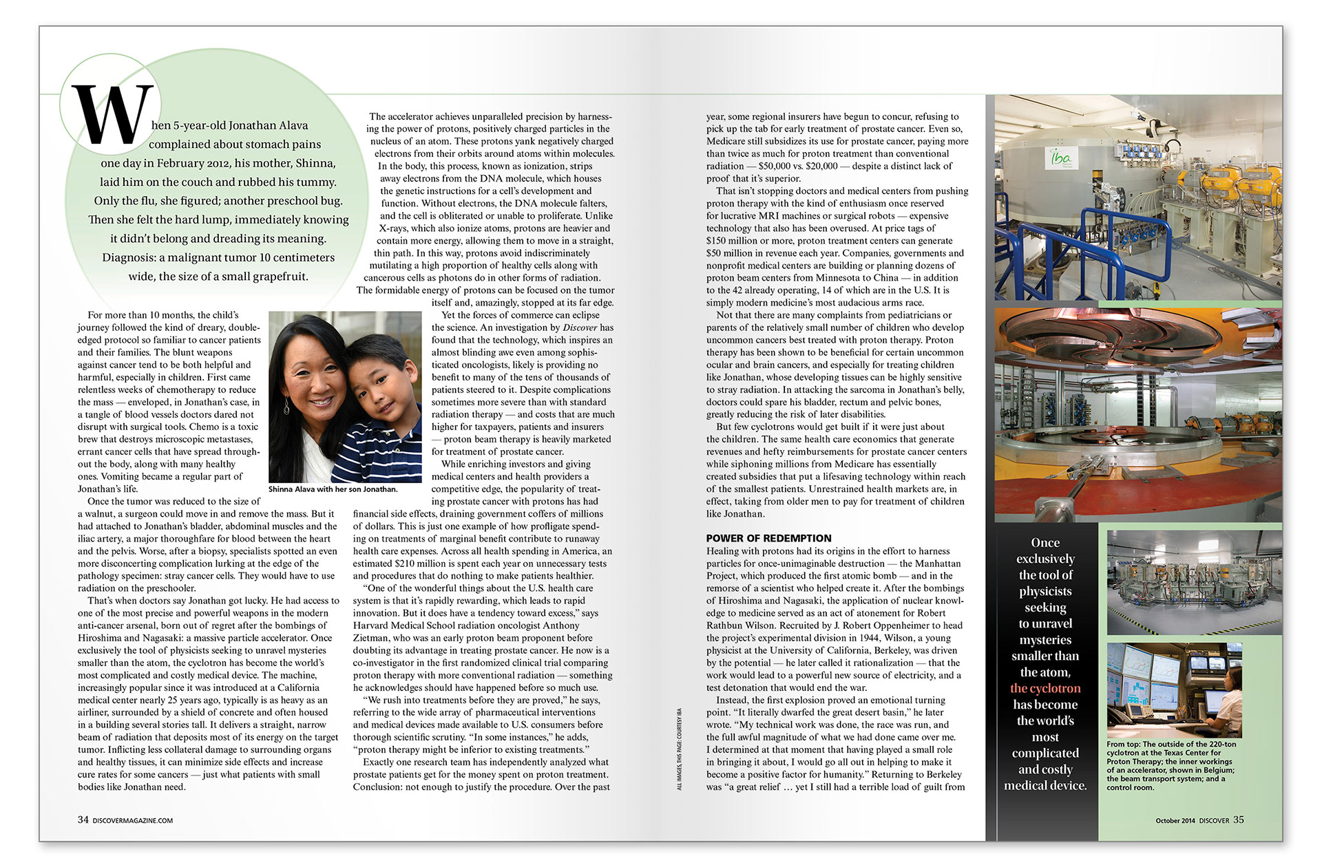
I served as art director, designer, and infographic director for this October 2014 piece in Discover magazine. For the lead and several insets, photo editor Ernie Mastroianni and I chose freelance photographer Peter Tobia. He had a limited amount of time in the hospital to gather the right shots, so we talked to him about the story and provided a details shot list of what we hoped to capture. I chose this lead because of the power invoked through the size comparison between child and machine — plus there's a beauty in the circular elements, which I used as a graphic element throughout the story.
I always make a point to not put all my bang into the lead element, but instead carry that design throughout the layout, in this case through typography, simple shapes, and a color theme.
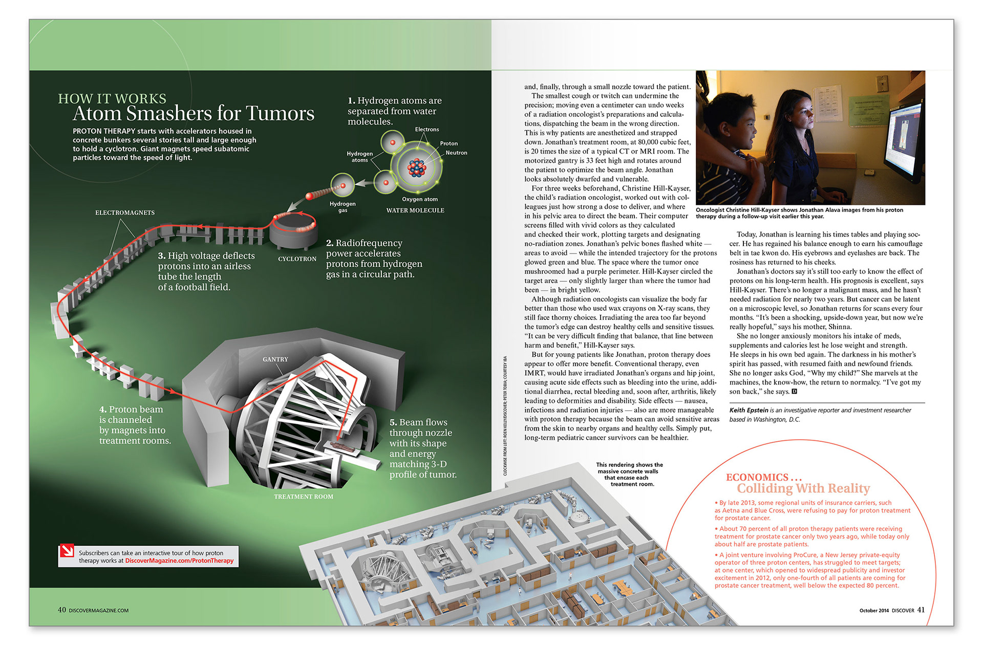
For the final page, I used sketch provided by the author as a basis to flesh out a simple but informative diagram of proton therapy, with a combination of hand-out art and original illustration created by in-house illustrator Roen Kelly.